Build a landing page in the "Studio Portfolio" style
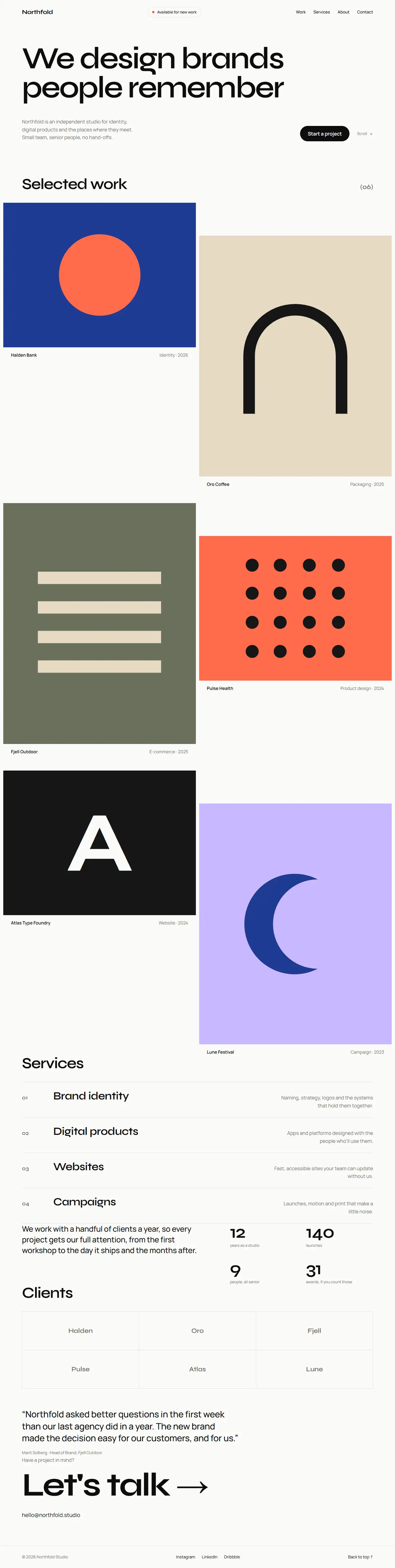
You are working in an existing project. Build the home page for {{product_name}}, a creative studio or a freelancer, in a confident minimal portfolio style: oversized type, a full-bleed grid of project tiles, numbered services and a huge contact link. Almost monochrome, with one hot accent used sparingly.
1. Adapt to this project
- Detect the framework and styling system already in use (for example Next.js + Tailwind, Vue, Svelte, plain HTML/CSS) and build with them.
- Reuse existing components and the project's theme where they fit. Map the tokens below onto the theme (CSS variables or the Tailwind config) instead of hard-coding hex values in components.
- Do not add a dependency without asking first. Project images: if the project has real case-study images, use them; otherwise build placeholder tiles from flat colours and simple CSS or SVG shapes, as described below. Never use stock photos of people.
2. Design tokens
- Light: background #fafaf8, text #0d0d0d, muted #6f6f6a, border #e3e3df, accent #ff4d1c (only for the availability dot, hover states, the selected service number and the contact underline).
- Dark (prefers-color-scheme: dark): background #0d0d0c, text #f2f2ee, muted #8f8f88, border #262624, accent #ff6a3d.
- Fonts (Google Fonts): display "Syne" 600/700 for the hero, section titles and the contact link; body "Manrope" 400/500/600.
- Type scale: hero 112px / 0.95 with -0.04em (52px on mobile), section titles 56px / 1 (36px mobile), service rows 40px (26px mobile), contact link 120px (56px mobile), body 18px / 1.6, small 14px.
- Radius: 0 for project tiles and rules, 999px for the availability pill and buttons. Spacing unit 8px. Sections 128px apart (80px mobile). Content max width 1360px with 40px side padding (20px mobile); the work grid runs edge to edge with 12px gaps.
3. Layout, section by section
- Navigation (not sticky): "{{product_name}}" in Syne 700 on the left; links (Work, Services, About, Contact) on the right in 15px medium; between them a pill "Available for new work" with a pulsing accent dot. On mobile the pill moves under the hero and links collapse into a "Menu" text button.
- Hero: the statement "{{tagline}}" in Syne at 112px across the full content width, max 3 lines. Under it, a two-column row: on the left a short muted paragraph about the studio (max 420px); on the right the button "{{primary_cta}}" (text-colour background, background-colour text, pill) and a "Scroll" label with a down arrow.
- Selected work: a header row with the section title "Selected work" and a "(06)" count in muted Syne. Then an edge-to-edge grid of six project tiles in two columns with alternating aspect ratios (4:3 and 4:5, so the columns stagger). Each tile is a flat colour block with one abstract shape (circle, stripes, arch, grid of dots, big letter) and, below it, a caption row: project name on the left, discipline and year in muted on the right. On hover the shape scales up 4% and the project name shows an accent arrow.
- Services: a section title, then four numbered rows separated by 1px borders: number in muted Syne ("01"), the service name in 40px Syne, and a muted one-line description aligned right. Hovering a row turns its number accent and moves the name 8px to the right.
- About and numbers: two columns: left a paragraph in 28px Manrope about how the studio works; right a 2 × 2 grid of numbers (Syne 64px) with small muted labels ("12 years", "140 launches", …).
- Clients and a testimonial: a 3 × 2 grid of fictional client names set in muted Syne with 1px borders between cells, then a large quote (32px) with the person's name and role.
- Contact: a muted label "Have a project in mind?", then a huge link "Let's talk →" (Syne 120px) whose underline grows from left to right in the accent colour on hover, and the studio email under it.
- Footer: a single row with the copyright on the left, social links in the middle (Instagram, LinkedIn, Dribbble as words) and "Back to top ↑" on the right, above a 1px border.
4. Components and details
- Headlines and quotes use text-wrap: balance so no line ends with a single orphaned word.
- The only filled button is the hero call to action; everything else is a text link with an underline that appears on hover.
- Placeholder tile colours: deep blue #1f3a93, sand #e6dac3, olive #6b705c, coral #ff6b4a, near-black #161616 and lilac #c9b8ff, each with its shape in a contrasting tone.
- Motion: the availability dot pulses (2s), tiles and service rows ease their hover changes over 300ms, the contact underline over 400ms. Turn it all off with prefers-reduced-motion.
5. Responsive and accessible
- Mobile (375px): the hero text never overflows (use clamp or a smaller size), the work grid becomes one column with 4:3 tiles, service descriptions drop under the names, the contact link fits on two lines at most.
- Visible focus rings (2px accent outline, 3px offset), contrast at least 4.5:1, one h1 (the hero statement), each tile is a link with the project name as its accessible name, and the decorative shapes are hidden from screen readers.
6. Content
Use these values and keep any {{…}} placeholder you don't have; ask me for it instead of inventing it. Write the remaining copy (projects, services, about) in a confident, plain voice that fits the studio.
- Studio name: {{product_name}}
- Statement: {{tagline}}
- Primary call to action: {{primary_cta}}
7. Done when