Build a landing page in the "Minimal SaaS" style
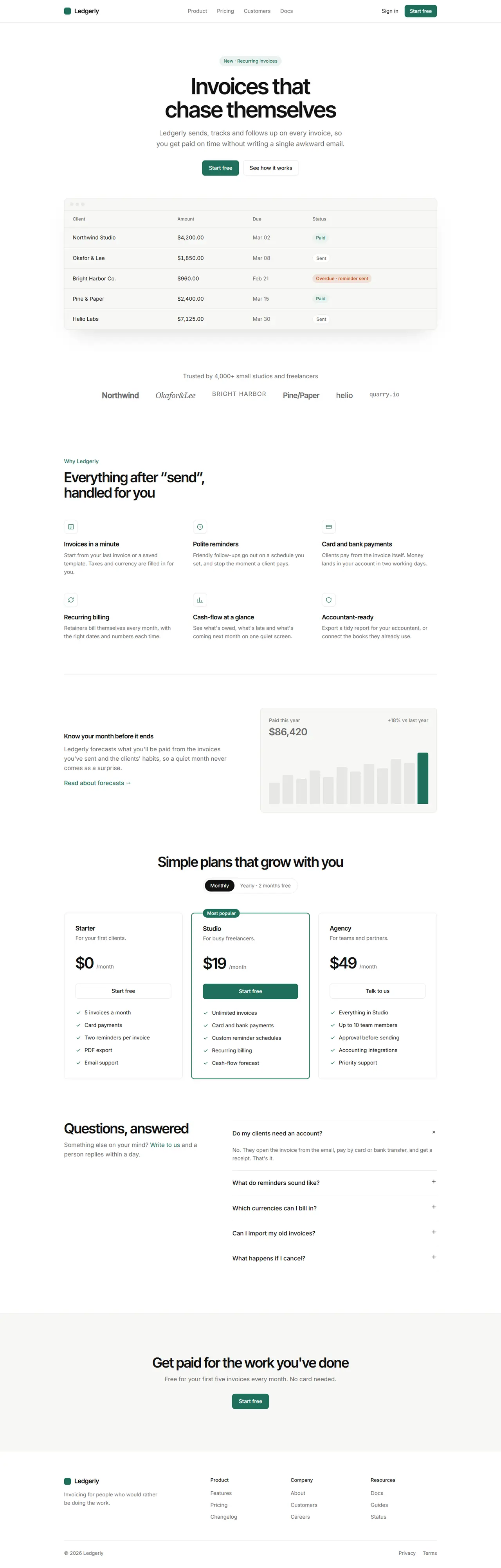
You are working in an existing project. Build a landing page for {{product_name}} in a calm, minimal SaaS style: lots of white space, one deep green accent, crisp hairline borders and a product mock-up in the hero.
1. Adapt to this project
- Detect the framework and styling system already in use (for example Next.js + Tailwind, Vue, Svelte, plain HTML/CSS) and build with them.
- Reuse existing components (buttons, cards, nav, footer) and the project's theme where they fit. Map the tokens below onto the theme (CSS variables or the Tailwind config) instead of hard-coding hex values in components.
- Do not add a dependency without asking first. Icons are simple inline SVG line icons (1.5px stroke) unless the project already has an icon set.
2. Design tokens
- Light: background #ffffff, surface #f7f7f5, text #111111, muted text #6b6b6b, border #e7e7e4, accent #1f6f5c, accent text on accent #ffffff, accent-soft #e8f2ee.
- Dark (prefers-color-scheme: dark, and the project's dark toggle if it has one): background #0f1110, surface #171a19, text #f2f2ef, muted #9a9d9a, border #262a28, accent #5cc4a4, text on accent #0f1110, accent-soft #15312a.
- Status colours for the mock-up: paid = accent, overdue #c2410c (dark #fb923c), sent = muted.
- Fonts (Google Fonts): headings "Inter Tight" 600, body "Inter" 400/500. Letter-spacing -0.03em on h1 and h2.
- Type scale: h1 64px / 1.05 (40px on mobile), h2 40px / 1.1 (30px mobile), h3 18px, body 17px / 1.6, small 14px.
- Radius: 10px cards, 8px buttons and inputs, 999px pills. Spacing unit 8px. Sections 120px top and bottom (72px mobile). Max content width 1120px with 24px side padding.
- Shadows: none, except the hero mock-up: 0 30px 60px -30px rgba(0,0,0,.18).
3. Layout, section by section
- Navigation (sticky, background with 85% opacity and backdrop blur, 1px bottom border): wordmark left (a 20px rounded square in the accent colour followed by "{{product_name}}" in Inter Tight 600), links centred (Product, Pricing, Customers, Docs) in muted text, right side a "Sign in" text link and a small primary button "{{primary_cta}}". Links collapse into a menu button below 768px.
- Hero (centred): a pill "New · Recurring invoices" (accent-soft background, accent text, 13px); the h1 "{{tagline}}" at most 14 words per line; a muted paragraph (max 560px) explaining the product in one sentence; a primary button "{{primary_cta}}" and a secondary outlined button "See how it works". Under them, 64px lower, a product mock-up: a browser-like card (surface background, border, three 10px grey dots in its top bar) showing a table of five invoices: client, amount (tabular numbers), due date and a status pill. Built with HTML and CSS, not an image.
- Social proof: one muted line "Trusted by 4,000+ small studios and freelancers", then a row of six fictional company wordmarks set in muted text with different weights. Wraps to two rows on mobile.
- Features: an eyebrow label in accent ("Why {{product_name}}"), an h2, then a 3 × 2 grid of features. Each has a 40px square with a 1px border and a line icon, an h3 and two lines of muted text. Below the grid, a wide split row: text on the left (h3, paragraph, a text link with an arrow), on the right a surface card with a simple bar chart of 12 months (CSS bars, the last one in accent).
- Pricing: centred h2 and a monthly/yearly toggle (pill-shaped segmented control). Three plan cards side by side: Starter, Studio, Agency. The middle card has a 2px accent border and a "Most popular" pill on its top edge. Each card: name, one-line description, price in 44px Inter Tight with "/month" in muted, a full-width button (primary in the middle card, outlined in the others), and a list of 5 features with accent check icons. Cards stack on mobile.
- FAQ: two columns: left an h2 and a muted line with a contact link; right five questions as native disclosure elements (details/summary) separated by borders, with a plus icon that rotates 45° when open.
- Final call to action: a full-width surface band with a centred h2, a muted line and the primary button "{{primary_cta}}".
- Footer: wordmark and one muted sentence on the left, three link columns (Product, Company, Resources), then a bottom row with the copyright and two small links, separated by a top border.
4. Components and details
- Headlines and quotes use text-wrap: balance so no line ends with a single orphaned word.
- Primary button: accent background, white text, 44px tall, 18px horizontal padding, medium weight; hover darkens by 8%. Secondary: transparent with a 1px border, text colour, hover surface background.
- Cards: surface or background colour, 1px border, no shadow.
- Motion: elements fade and rise 12px when they scroll into view (300ms ease-out); buttons and links transition colours in 150ms. Turn all motion off with prefers-reduced-motion.
5. Responsive and accessible
- Mobile (375px): one column everywhere, the hero mock-up scrolls horizontally inside its card instead of overflowing the page, nav links behind a menu button.
- Visible focus rings (2px accent outline, 2px offset), text contrast at least 4.5:1, one h1, labelled navigation, and the toggle and accordion work with the keyboard.
6. Content
Use these values and keep any {{…}} placeholder you don't have; ask me for it instead of inventing it. Write the remaining copy (features, plans, FAQ) to fit the product.
- Product name: {{product_name}}
- Tagline: {{tagline}}
- Primary call to action: {{primary_cta}}
7. Done when