Landing page
Warm Consumer
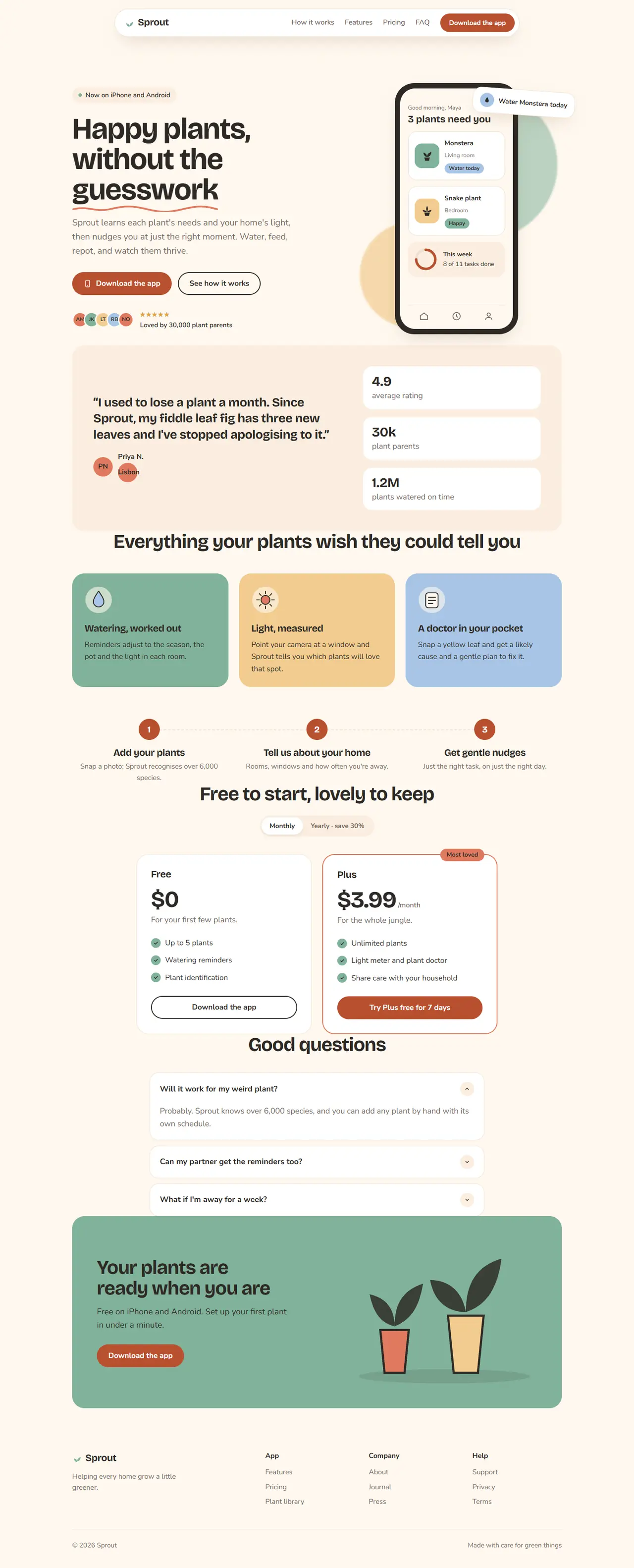
Friendly and soft: cream backgrounds, pastel cards, big rounded corners, a phone mock-up and simple illustrations. Suits mobile apps, wellness and lifestyle products.
Your details
Filled into the prompt as you type. Leave one blank and the AI will ask you for it.
Prompt
Build a landing page in the "Warm Consumer" style
You are working in an existing project. Build a landing page for {{product_name}}, a consumer app, in a warm and friendly style: cream backgrounds, soft pastel blocks, big rounded corners, a phone mock-up and simple hand-made-looking illustrations.
1. Adapt to this project
- Detect the framework and styling system already in use (for example Next.js + Tailwind, Vue, Svelte, plain HTML/CSS) and build with them.
- Reuse existing components and the project's theme where they fit. Map the tokens below onto the theme (CSS variables or the Tailwind config) instead of hard-coding hex values in components.
- Do not add a dependency without asking first. Illustrations are simple inline SVG shapes (leaves, pots, drops, suns) in the palette colours, not stock photos. Do not use app store logos; the download buttons are plain buttons with a phone icon.
2. Design tokens
- Light: background #fff8ef, surface #ffffff, soft surface #fbeee0, text #2d2a26, muted #75695e, border #efe1d0, accent terracotta #b9502f (buttons, links; white text on it), and decorative pastels: coral #e07a5f, sage #81b29a, butter #f2cc8f, sky #a8c5e6 (backgrounds and illustrations only, never behind body text without checking contrast).
- Dark (prefers-color-scheme: dark): background #1d1a17, surface #26221e, soft surface #2f2a24, text #f6efe6, muted #b5a898, border #3a332c, accent #f08a6b with text #1d1a17; pastels drop to 70% saturation and sit on the dark surfaces.
- Fonts (Google Fonts): headings "Bricolage Grotesque" 700 with -0.02em letter-spacing, body "Nunito Sans" 400/600/700.
- Type scale: h1 68px / 1.02 (42px on mobile), h2 44px / 1.08 (32px mobile), h3 22px, body 18px / 1.6, small 15px.
- Radius: 28px large cards, 20px small cards, 999px buttons and pills. Shadow: 0 16px 40px -16px rgba(120,80,40,.28). Spacing unit 8px. Sections 112px apart (72px mobile). Max width 1160px, 24px side padding.
3. Layout, section by section
- Navigation: a rounded pill bar (surface background, 1px border, soft shadow) centred at the top with the wordmark "{{product_name}}" and a small leaf icon in sage, links (How it works, Features, Pricing, FAQ) and a terracotta pill button "{{primary_cta}}". Links collapse into a round menu button on mobile.
- Hero (two columns): left: a soft-surface pill with a tiny sage dot ("Now on iPhone and Android"); the h1 "{{tagline}}" with one word underlined by a hand-drawn wavy SVG line in coral; a paragraph; two pill buttons: terracotta "{{primary_cta}}" with a phone icon and an outlined "See how it works"; a row of five overlapping round avatars (pastel circles with initials) and "Loved by 30,000 plant parents" with five stars. Right: a phone mock-up (rounded 44px frame in text colour, 280 × 570) showing an app screen: a greeting, a plant card with a watering-due chip, a progress ring and a small tab bar; behind the phone two blurred-edge pastel blobs (sage and butter) and a floating card "Water Monstera today" with a drop icon, tilted 4°, overlapping the phone's top-right corner without covering any text on the screen (on mobile it sits over the bottom edge instead).
- Social proof: a soft-surface card with 28px radius holding one large testimonial quote, the person's avatar circle, name and city, plus three stats in a row ("4.9 rating", "30k plant parents", "1.2M plants watered").
- Features: an h2 centred, then three large pastel cards in a row (sage, butter, sky backgrounds in light mode, with text colour #2d2a26), each with an SVG illustration at the top, an h3 and a paragraph. Under them, "How it works" as three numbered steps in a row: a 48px terracotta circle with the number, a title and a line of text, joined by a dashed line on desktop.
- Pricing: two plan cards side by side (Free and Plus), with a monthly/yearly pill switch above. Plus has a coral 2px border and a "Most loved" pill. Prices in Bricolage Grotesque 52px. Feature lists use sage check circles.
- FAQ: rounded cards (20px radius, surface background, 1px border) as details/summary, each with a round chevron button that rotates when open, 12px apart, max width 760px.
- Final call to action: a big sage card (28px radius) with an illustration of potted plants on the right, the h2, a sentence and the terracotta button "{{primary_cta}}".
- Footer: wordmark and a one-line mission, three link columns, and a bottom row with the copyright and "Made with care for green things".
4. Components and details
- Headlines and quotes use text-wrap: balance so no line ends with a single orphaned word.
- Buttons: 52px tall pills, 700 weight; hover lifts 2px with the soft shadow; outlined buttons use a 2px border in the text colour.
- Cards lift 4px on hover with the soft shadow. Inputs and chips are pills.
- Motion: the floating card bobs up and down 6px over 4s; elements fade up 16px on scroll (400ms). Turn it all off with prefers-reduced-motion.
5. Responsive and accessible
- Mobile (375px): one column, the phone mock-up scales to fit (max 260px wide) with the blobs clipped inside the section, steps stack vertically without the dashed line.
- Visible focus rings (3px outline in the accent colour, 3px offset), text contrast at least 4.5:1 (check text on every pastel), one h1, avatars and blobs hidden from screen readers, and the phone mock-up has a text alternative.
6. Content
Use these values and keep any {{…}} placeholder you don't have; ask me for it instead of inventing it. Write the remaining copy in a warm, encouraging voice that fits the product.
- Product name: {{product_name}}
- Tagline: {{tagline}}
- Primary call to action: {{primary_cta}}
7. Done when
- All eight sections exist and use the tokens above in light and dark mode.
- No horizontal scroll at 375px.
- The page builds and passes the project's lint, with no new dependencies.
Paste it into Claude Code, Cursor, v0 or any AI coding tool, inside the project you want to restyle. The prompt tells it to use your stack and components and to ask before adding dependencies.