Landing page
Neo-Brutalist
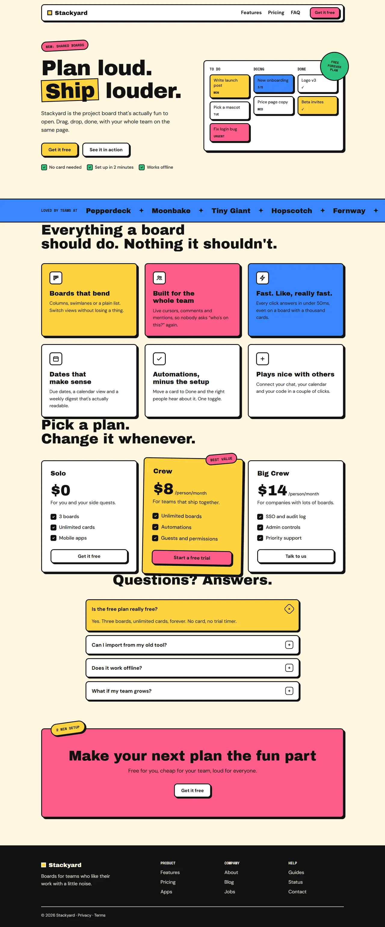
Loud and playful: thick black outlines, hard offset shadows, flat bright blocks, chunky type and tilted stickers. Suits consumer apps, startups and anything that wants to stand out.
Your details
Filled into the prompt as you type. Leave one blank and the AI will ask you for it.
Prompt
Build a landing page in the "Neo-Brutalist" style
You are working in an existing project. Build a landing page for {{product_name}} in a loud, playful neo-brutalist style: thick black outlines, hard offset shadows, flat bright colour blocks, chunky type and a few tilted stickers.
1. Adapt to this project
- Detect the framework and styling system already in use (for example Next.js + Tailwind, Vue, Svelte, plain HTML/CSS) and build with them.
- Reuse existing components where they fit, restyled with the tokens below. Map the tokens onto the theme (CSS variables or the Tailwind config) instead of hard-coding hex values in components.
- Do not add a dependency without asking first. Icons are simple inline SVGs with a 2.5px stroke, no emoji.
2. Design tokens
- Light: background #fff6e0 (cream), surface #ffffff, ink #111111 (text, every border and every shadow), yellow #ffd23f, pink #ff5c8a, blue #3a86ff, green #2ec27e. Text on any colour block is always #111111.
- Dark (prefers-color-scheme: dark): background #16140f, surface #23201a, ink #f4ecd8 (text, borders and shadows); the four bright colours stay the same, and text on them stays #111111.
- Borders: 3px solid ink on every card, button, input and the nav. Shadows: hard, no blur: 6px 6px 0 ink (4px 4px 0 on small items).
- Fonts (Google Fonts): headings "Archivo Black" (uppercase is fine for short labels, not for headlines), body "DM Sans" 400/500/700, labels "Space Mono" 700 uppercase.
- Type scale: h1 80px / 0.95 with -0.02em (46px on mobile), h2 52px / 1 (34px mobile), h3 24px, body 18px / 1.55, labels 13px.
- Radius: 12px on cards and buttons, 999px on stickers. Spacing unit 8px. Sections 104px apart (64px mobile). Max width 1180px, 24px side padding.
3. Layout, section by section
- Navigation: a floating bar 16px from the top, surface background, 3px border, 12px radius and a 4px hard shadow. Wordmark "{{product_name}}" in Archivo Black with a small yellow square before it; links (Features, Pricing, FAQ) in bold body text; a pink button "{{primary_cta}}" on the right. Links collapse into a bordered menu button on mobile.
- Hero (two columns): left: a tilted (-3°) pink sticker label ("New: shared boards"); the h1 "{{tagline}}" where one word sits on a yellow block rotated -2°; a paragraph; a yellow primary button "{{primary_cta}}" and a white secondary button "See it in action"; a small row of three proof points with green check squares. Right: a mock board in a white card with three columns (To do, Doing, Done), each holding 2–3 small task cards in yellow, pink, blue or white, all with borders and 4px shadows; a round green sticker "Free forever plan" overlaps the card's top-right corner, tilted 8°.
- Social proof: a full-width blue band with a 3px ink border top and bottom, holding a label "Loved by teams at" and six fictional company names in Archivo Black, separated by star shapes. On wide screens the row can slide slowly (a CSS marquee) and stops for prefers-reduced-motion.
- Features: an h2, then a 3-column grid of cards: the first yellow, the second pink, the third blue, then three white ones. Each card has a 48px black-bordered square with an icon, an h3 and a paragraph. Cards lift by moving -2px, -2px with a bigger shadow on hover.
- Pricing: three plan cards; the middle one is yellow, tilted 1° and slightly larger, with a pink "Best value" sticker. Prices in Archivo Black 56px. Feature lists use small ink check squares. Each card ends with a full-width button.
- FAQ: a single column (max 800px) of bordered accordions (details/summary) with 4px shadows, 12px apart; the open one turns yellow. A plus sign in a small bordered square rotates to an x when open.
- Final call to action: a big pink block with a 3px border and a 6px shadow, the h2 in ink, a line of text and a white button "{{primary_cta}}"; a tilted yellow sticker in a corner.
- Footer: an ink-coloured band with cream text (it inverts in dark mode): wordmark, three link columns and a copyright line.
4. Components and details
- Headlines and quotes use text-wrap: balance so no line ends with a single orphaned word.
- Buttons: 52px tall, bold, 3px border, 4px shadow; on hover they move 2px right and down and the shadow shrinks to 2px (a "press"); on active the shadow disappears.
- Stickers: round or pill shapes with a border, Space Mono labels, small rotations between -8° and 8°.
- Motion: only the press effect, the card lift and the optional marquee. All off with prefers-reduced-motion.
5. Responsive and accessible
- Mobile (375px): one column, stickers stay inside the viewport (no horizontal scroll from rotations or shadows), the board keeps its three columns but shrinks, the marquee becomes a wrapped list.
- Visible focus rings (3px outline in blue, 3px offset), contrast at least 4.5:1 (ink on every colour), one h1, and decorative stickers hidden from screen readers when they repeat nearby text.
6. Content
Use these values and keep any {{…}} placeholder you don't have; ask me for it instead of inventing it. Write the remaining copy in a cheerful, punchy voice that fits the product.
- Product name: {{product_name}}
- Tagline: {{tagline}}
- Primary call to action: {{primary_cta}}
7. Done when
- All eight sections exist and use the tokens above in light and dark mode.
- No horizontal scroll at 375px.
- The page builds and passes the project's lint, with no new dependencies.
Paste it into Claude Code, Cursor, v0 or any AI coding tool, inside the project you want to restyle. The prompt tells it to use your stack and components and to ask before adding dependencies.