Landing page
Editorial
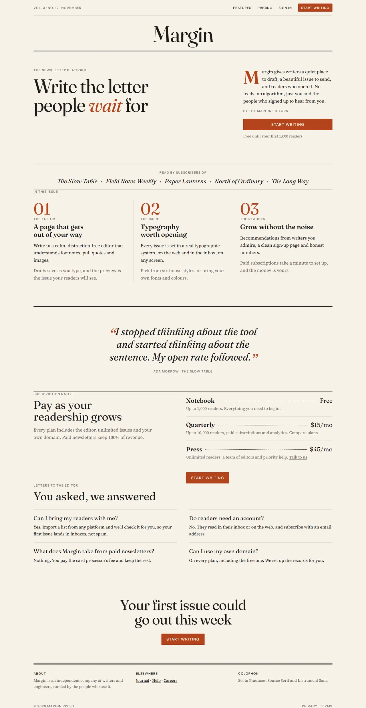
A printed-magazine front page: masthead, big Fraunces headlines, column grids, hairline rules, a drop cap and a pull quote on warm paper. Suits newsletters, media and writing tools.
Your details
Filled into the prompt as you type. Leave one blank and the AI will ask you for it.
Prompt
Build a landing page in the "Editorial" style
You are working in an existing project. Build a landing page for {{product_name}} that reads like the front page of a printed magazine: a masthead, big serif headlines, column grids, hairline rules, a drop cap and a pull quote, on warm paper.
1. Adapt to this project
- Detect the framework and styling system already in use (for example Next.js + Tailwind, Vue, Svelte, plain HTML/CSS) and build with them.
- Reuse existing components and the project's theme where they fit. Map the tokens below onto the theme (CSS variables or the Tailwind config) instead of hard-coding hex values in components.
- Do not add a dependency without asking first. No images: the page is all type and rules.
2. Design tokens
- Light: paper #f6f1e8, surface #efe8da, ink #1c1a17, muted #6e665b, strong rule = ink, light rule #d8cfbf, accent rust #b4441c, text on accent #f6f1e8.
- Dark (prefers-color-scheme: dark): paper #171513, surface #201d1a, ink #ede6d9, muted #a39a8c, strong rule = ink, light rule #3a352f, accent #e8875a, text on accent #171513.
- Fonts (Google Fonts): display "Fraunces" (400, 600 and 400 italic, optical size high), body "Source Serif 4" 400/600, labels "Instrument Sans" 500 uppercase with 0.12em tracking.
- Type scale: masthead wordmark 88px (48px on mobile), h1 76px / 0.98 with -0.02em (44px mobile), h2 44px / 1.05, article titles 26px / 1.15, body 18px / 1.6, labels 12px.
- Rules: 1px light rules between items; a strong 3px double rule (two 1px ink lines 3px apart) under the masthead and above the footer. Radius 0 everywhere except buttons (2px).
- Grid: 12 columns, 24px gutters, max width 1240px, 32px side padding (20px mobile). Sections 96px apart (64px mobile).
3. Layout, section by section
- Masthead: a thin top strip with a label on the left ("Vol. 3 · No. 12", today's month) and small links on the right (Features, Pricing, Sign in, and a small accent button "{{primary_cta}}"). Under it, "{{product_name}}" centred as a huge Fraunces wordmark, then the double rule. On mobile the links collapse into a "Menu" text button.
- Hero: on the 12-column grid, columns 1–7 hold a label ("The newsletter platform") and the h1 "{{tagline}}" with one key word set in italic accent. Columns 9–12, separated by a vertical light rule, hold a "lead story": a short paragraph with a 3-line drop cap in the accent colour, a byline in labels style, and a full-width accent button "{{primary_cta}}" plus a muted line "Free until your first 1,000 readers".
- Social proof as a "Read by" line: a label, then five fictional publication names in Fraunces italic separated by bullets, centred between two light rules.
- Features as articles: a label "In this issue" and three columns, each starting with a big numeral (01, 02, 03) in Fraunces, a label kicker, an article title and two short paragraphs. Columns are separated by vertical light rules (horizontal rules on mobile).
- Pull quote: a full-width section with a strong rule above and below, a 40px Fraunces italic quote centred (max 900px) with large accent quotation marks, and the attribution in labels style.
- Pricing as "Subscription rates": two columns: the h2 and a short paragraph on the left; on the right three plan lines in the style of a price list: plan name in Fraunces, a dotted leader filling the space, and the price; each with a one-line muted description under it and a text link. Under them, the accent button.
- FAQ as "Letters to the editor": two columns of question and answer pairs. Questions in Fraunces 22px, answers in body text, each pair separated by a light rule.
- Final call to action and footer: a centred h2 with the accent button, then the double rule and a colophon: three short columns in small type (About, Elsewhere, Colophon listing the fonts), and the copyright line.
4. Components and details
- Headlines and quotes use text-wrap: balance so no line ends with a single orphaned word.
- Accent button: accent background, paper-coloured text, labels font, 14px, 2px radius, 44px tall; hover darkens. Text links are ink with a 1px underline offset 3px that turns accent on hover.
- Drop cap: float left, Fraunces 600, three lines tall, accent colour.
- Motion: none beyond colour transitions on links and buttons (150ms). Keep it still, like paper.
5. Responsive and accessible
- Mobile (375px): one column, the masthead wordmark scales down and never wraps or overflows, vertical rules become horizontal rules, the dotted leaders still line up.
- Visible focus rings (2px accent outline, 2px offset), contrast at least 4.5:1 including muted text on paper, one h1 (the hero headline; the masthead wordmark is not a heading), and the quote is marked up as a blockquote with a figcaption.
6. Content
Use these values and keep any {{…}} placeholder you don't have; ask me for it instead of inventing it. Write the remaining copy (articles, rates, letters) in an editorial voice that fits the product.
- Product name: {{product_name}}
- Tagline: {{tagline}}
- Primary call to action: {{primary_cta}}
7. Done when
- All eight sections exist and use the tokens above in light and dark mode.
- No horizontal scroll at 375px.
- The page builds and passes the project's lint, with no new dependencies.
Paste it into Claude Code, Cursor, v0 or any AI coding tool, inside the project you want to restyle. The prompt tells it to use your stack and components and to ask before adding dependencies.